
Loading Park Labs...
Loading Park Labs...
LAB NOTE No.0112025.12.28Milestone
Every time I saw a number like "Korea's fertility rate: 0.72" in the news, it didn't feel real. So I decided to visualize it myself. I wanted to show just how serious 0.72 is by putting it next to other countries. The result is Population Simulator, which I launched on December 28.
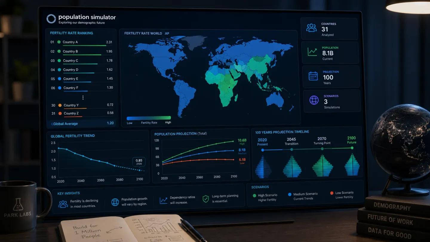
Table 1
| Item | Details |
|---|---|
| Service | Population Simulator |
| Launch | December 28, 2025 |
| What it does | Colors fertility rates for 31 countries on a 3D globe, with a ranking and a 100-year population simulation |
| Risk levels | EXTREME below 1.0, SEVERE 1.0–1.5, CRITICAL 1.5–2.1, STABLE above 2.1 |
| Data | UN Population Data 2024 |
I built the 3D globe with Three.js. It's WebGL-based, so it runs fine on desktop, but frames drop a bit on mobile. Rendering 31 countries' data at once has limits I can't fully avoid. It needs optimizing, but I haven't gotten to it yet.
Sorted from lowest, Korea is #1 at 0.72... #2 is Hong Kong (0.77), #3 Singapore (0.85). Knowing the numbers and actually lining up 31 countries side by side turned out to be different things. Run the 100-year simulation and there are plenty of countries where the population falls below half. I felt a little choked up putting the data together.
Honestly, I didn't build this to make money. I just wanted to make it. I could put AdSense on it, but more than that, I hope people look at this data and feel a bit of the weight of what's actually happening.