
Park Labs Website Refinement - Polishing Bit by Bit
Navigation redesign, marquee component, image optimization - small refinements adding up. The more I build, the more I find to fix.
Been polishing the Park Labs website here and there.
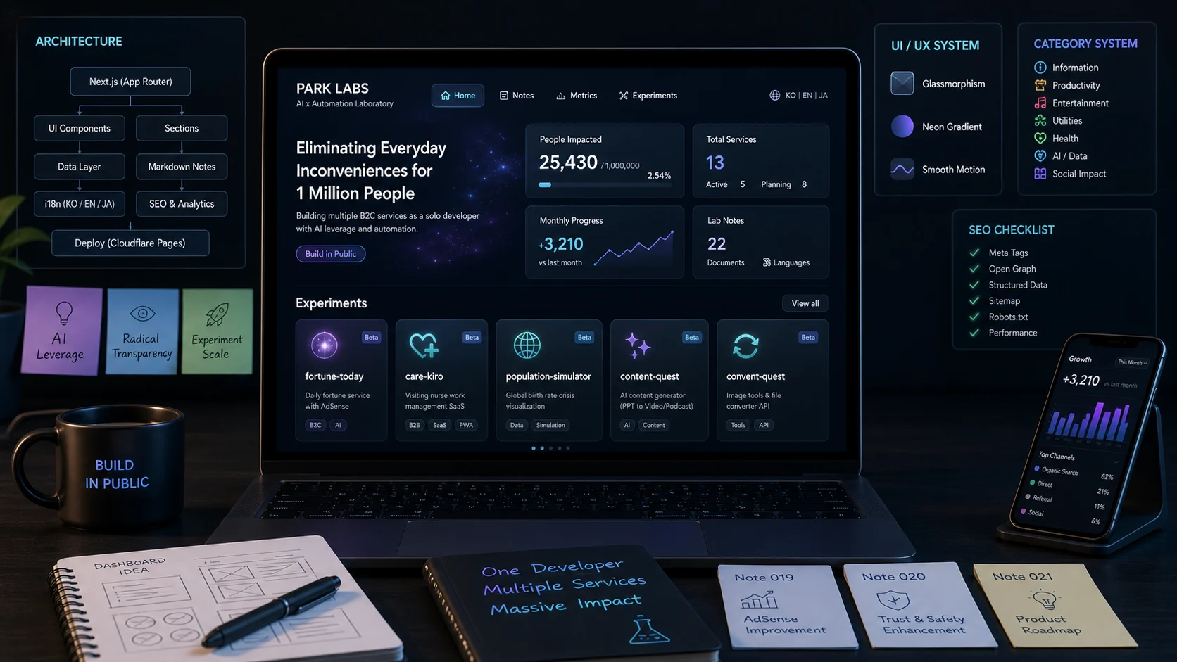
🔬 Not Just a Site, It's a Lab
Started as "a portfolio showing experiment list." But as I built it, the site itself became an experiment. Design, performance, SEO, internationalization... all experiments.
What this site does now:
🎨 Recent Changes
Here's what changed in the last few days:
Navigation Redesign
The old nav was clunky. Rebuilt it with a minimal style. Put extra effort into mobile navigation too. Bottom nav bar approach, works pretty well.
WebP Image Conversion
Converted all PNG images to WebP. File sizes dropped by more than half. Serving through Cloudflare Pages, so the speed difference is noticeable.
Region Target Badges
Each experiment card now shows which market it targets (Global, Japan, Korea) as a badge. You can see at a glance which experiment is aiming where.
Lab Notes Marquee
Added today. Latest lab notes slowly scroll across the homepage. Pauses on hover, click to navigate to the note. Built with CSS animation.
note.com Integration
I also write on note.com, a Japanese content platform. Added social links to the footer and mobile sidebar. Makes sense to have a presence on Japanese platforms since I have Japan-targeted experiments.
Lab Note Automation
Created a /note Claude Code skill. Just throw in a topic and it auto-numbers, generates 3-language markdown, verifies the build, and commits/pushes. Writing notes got a lot easier.
🌏 3-Language Support
Korean, English, Japanese. Built with next-intl. Translation files are already over 800 lines, and maintaining them is surprisingly hard. Every time I add an experiment, I need descriptions in 3 languages.
But since I have Japan-targeted experiments (fortune-today, uranai-musume, care-kiro), Japanese support is a must.
💎 Glassmorphism Design
The design theme is "futuristic laboratory." Black background, translucent cards, neon gradients. Might seem over the top, but I think it fits the lab concept.
Tried a convex glass effect on the unicorn progress card. Made with inset shadow and gradient combos — not sure if it turned out well.
📝 Lab Notes System
Started as hardcoded data, then switched to markdown-based. Drop a markdown file in content/notes/ and a note appears automatically. Frontmatter for metadata, parsed with gray-matter.
Categories, moods, related experiment tagging all work. With 15 notes stacked up, it's starting to feel like a proper blog.
🎯 What's Next?
Didn't expect building the site to be this fun. It's the home for all my other experiments, so I need to keep it polished.