
Loading Park Labs...
Loading Park Labs...
LAB NOTE No.0042025.08.18Development
As the number of experiments grew, the homepage started turning into a mess. Just listing everything in a row made it impossible to tell what's what, so on August 18, 2025, I built a category system.
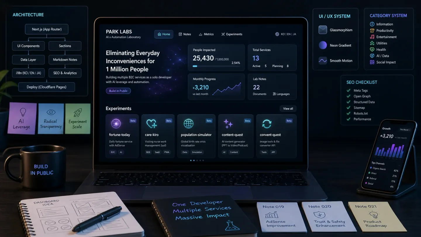
Table 1
| What changed | Before | After |
|---|---|---|
| Experiment categories | None | 12 categories, a badge on every experiment |
| Homepage | Experiments listed one after another | 5 groups (Lifestyle, Business, Information, Productivity, Others) |
| Roadmap section | Roadmap | Journey to Unicorn |
I split the categories into things like Lifestyle, Productivity and Business. I started with 12, which might be too many.
The homepage had a toggle to open and close each group, but it made things more complicated, so I took it out. Turns out seeing everything at once is better. When I changed "Roadmap" to "Journey", I spent forever tweaking CSS for the card sizes.
The card layout was breaking at Tailwind's responsive breakpoints. It turned out to be a grid config issue. The cause: I'd only been looking at desktop and never checked mobile. The component structure is also getting more complex and looks like it needs some cleanup.
In the end I was reminded again that making things complicated doesn't help. Keeping it simple actually looks better. Solo dev means decisions are fast, which is nice, but it also means there's no one to stop a bad one.